

View Service
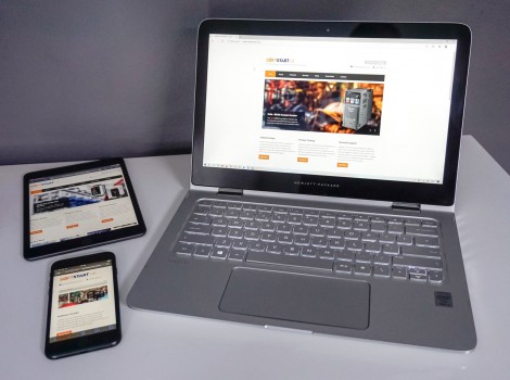
Responsive Website Design
My fully responsive designs make your website look great and function well on whatever device your customers are using.
Responsive website design means that your website automatically resizes to suit the device it is being viewed on, from a traditional computer to mobile devices. Being responsive also means that the switch in size and orientation doesn’t undermine the content and graphics.
I use a specifically-developed framework to build responsive design websites.
Starting from the ground up, I develop website themes that incorporate any content.
If you are looking to make your website responsive, please contact me today.
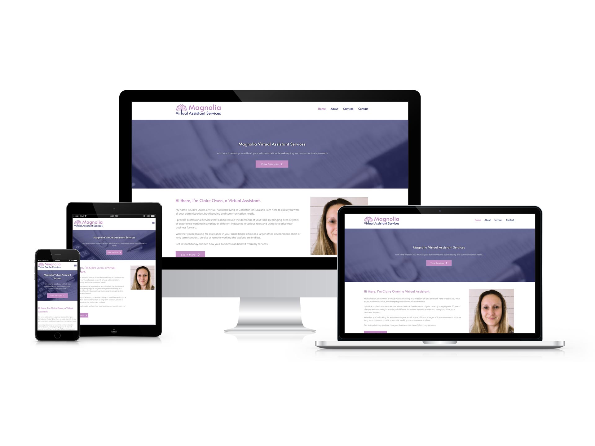
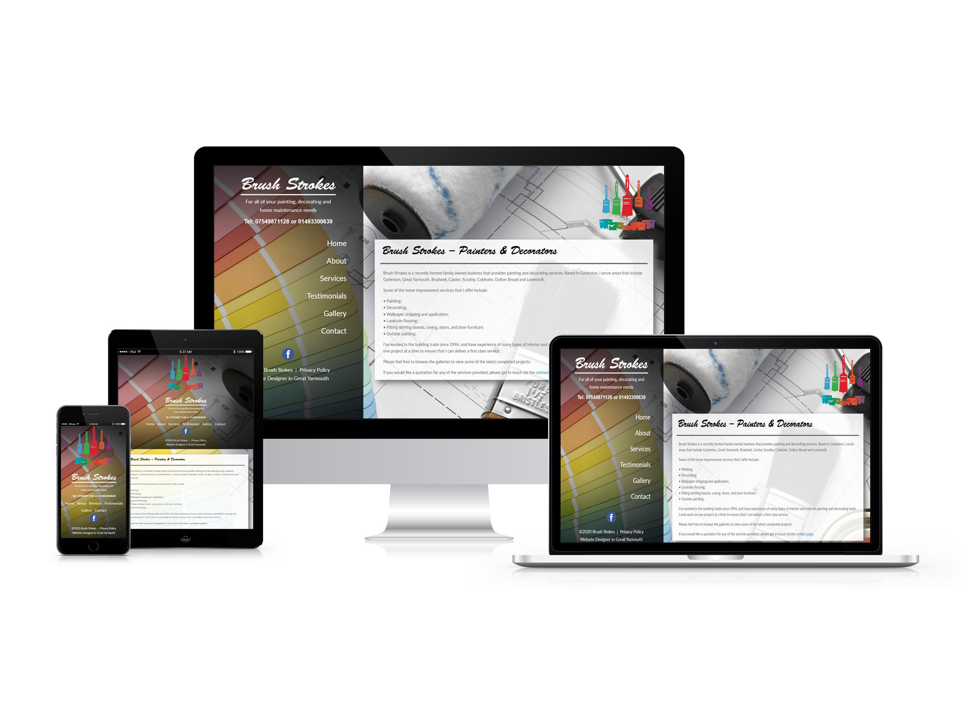
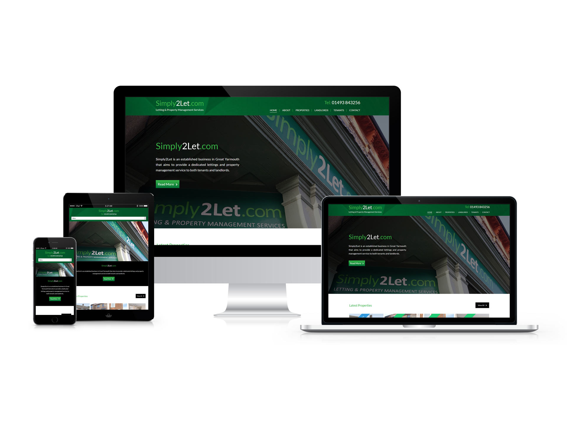
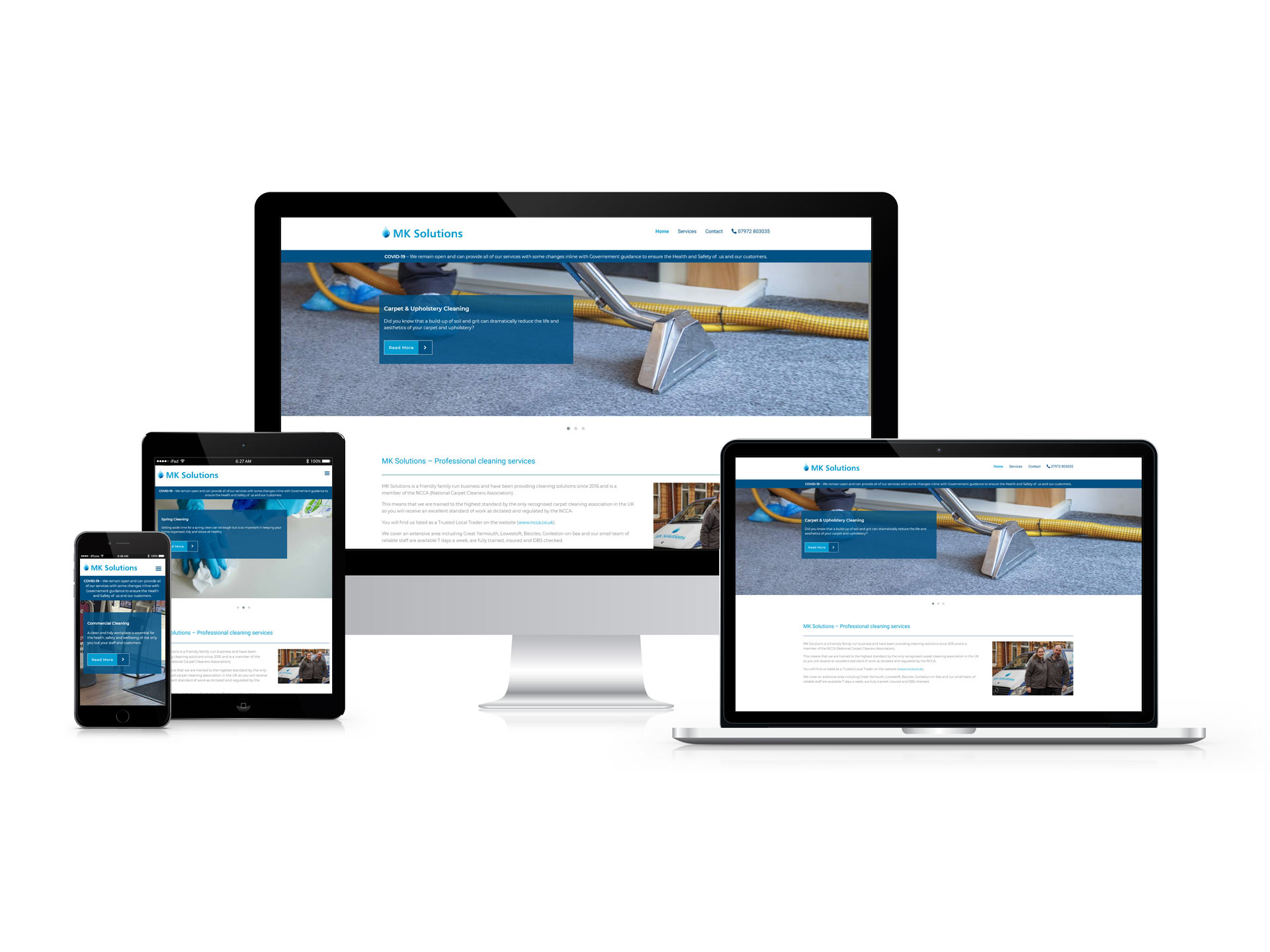
Recent Projects
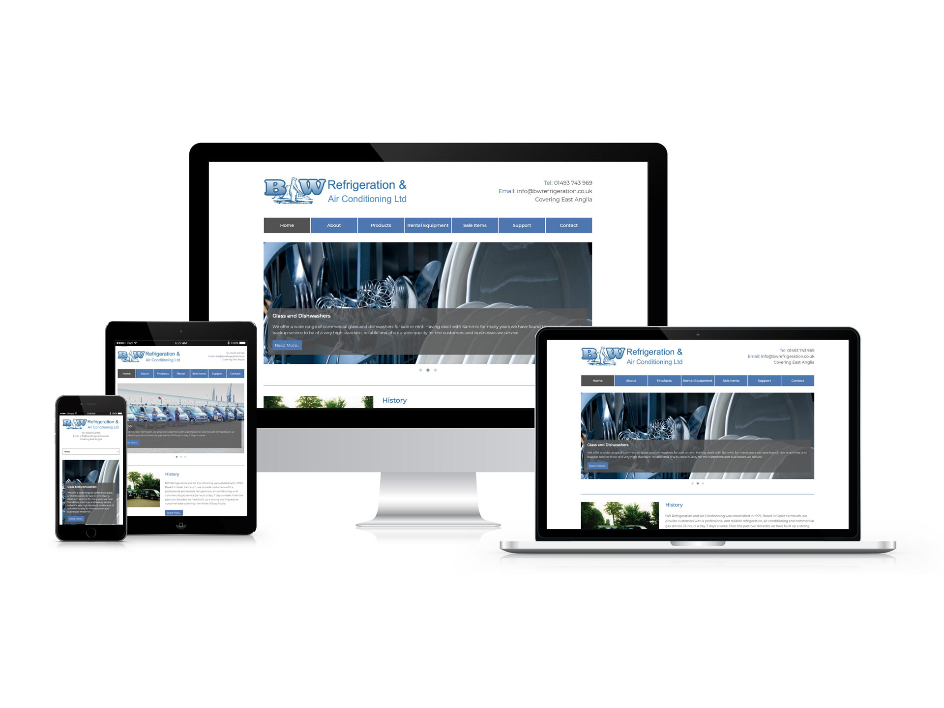
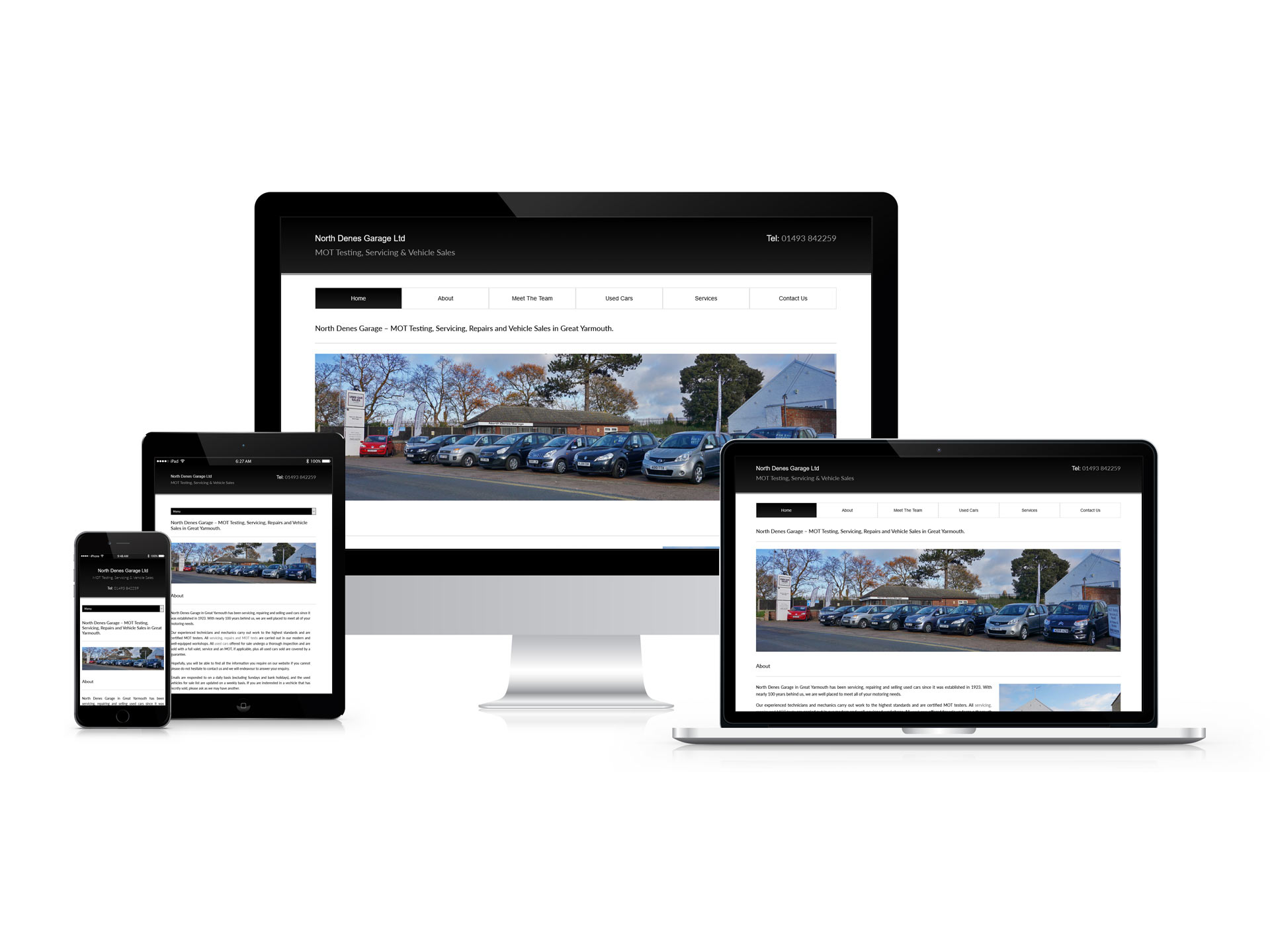
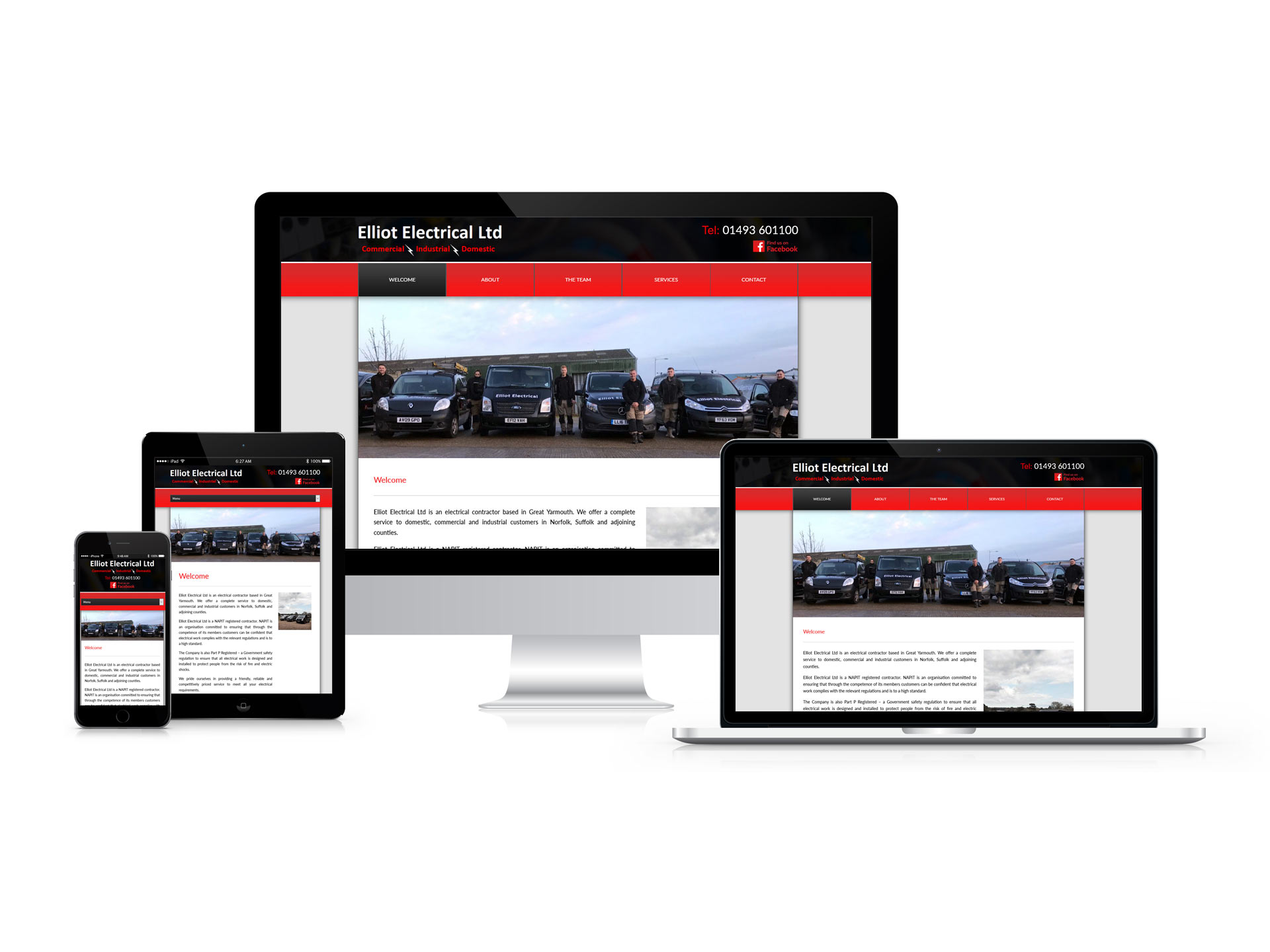
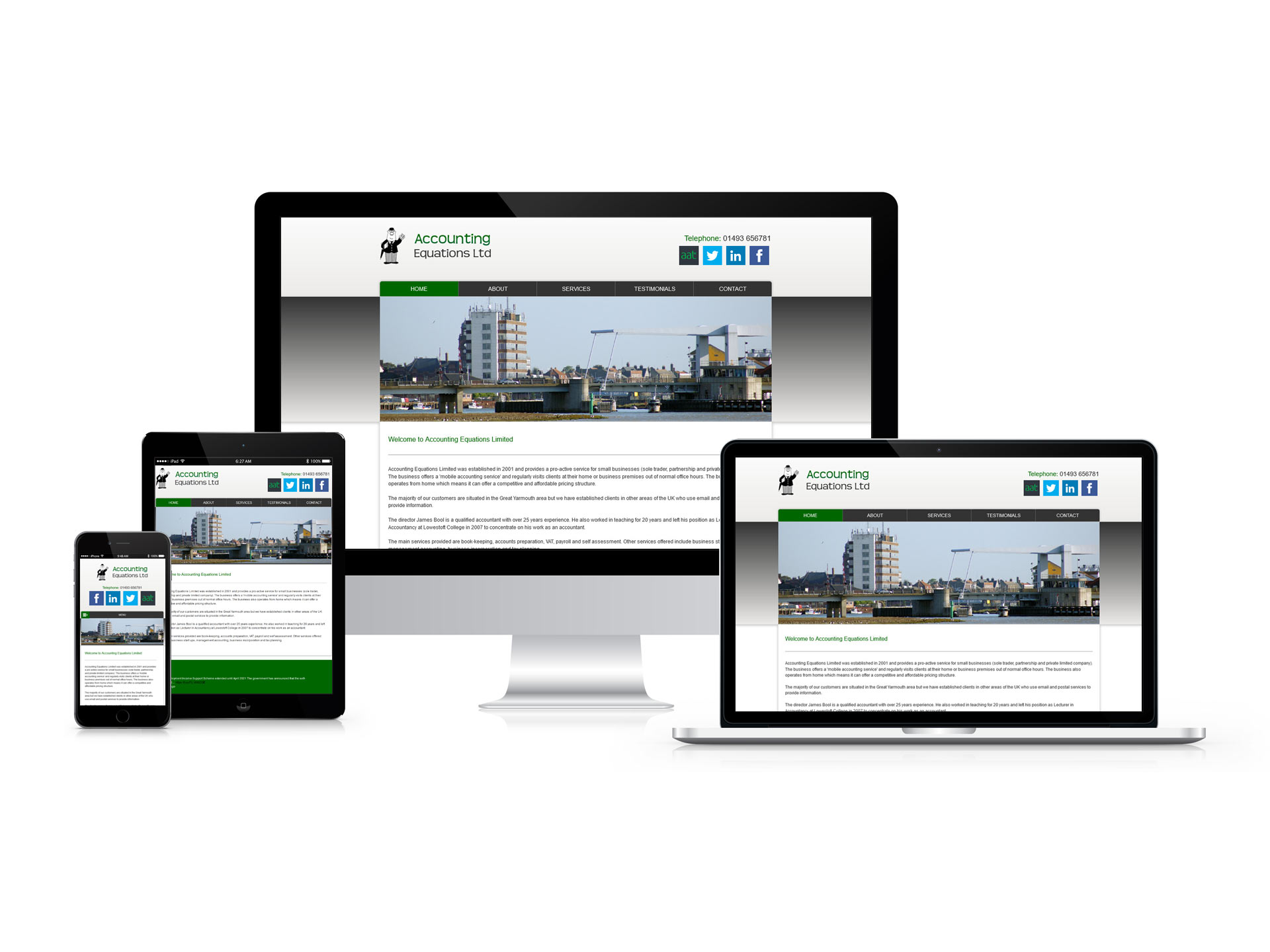
Below you will find some examples of my most recent responsive website design projects.
Services
I will showcase your products, services, values, and branding through an informative, user-friendly, and interactive experience.


What my clients say
I contacted Chris to host and redesign my country cottage and caravan websites. With his added photography skills, it was the perfect solution for me. To have all our needs fulfilled by Chill Web Designs was such a time saver. Chris was always responsive to calls and emails and was able to turn around both websites in a short space of time. Professional in all aspects, I would not hesitate to recommend Chris and Chill Web Designs Services.

Jill Nicholls
Lower Wood Farm
We would like to highly commend your work in rejuvenating Softstart UK’s website, we asked you to bring a new innovative and fresh look to the site, we are delighted with the work you did in what was a complex redesign working with our new company logo and colour schemes.

Stuart Harvey
Softstart UK Limited
We have been using Chris as our web designer for a number of years and have found his professional knowledge to be second to none. He has provided us with an outstanding facility and I could not recommend his services more highly.

James Bool
Accounting Equations Limited
Chris was charged with the task of redesigning our site and designing a facility where the site can be updated through our existing software. This was carried out in a very professional manner and I would not hesitate in recommending him to anybody who requires a web design service.

Tony Quin
Simply 2 Let Limited
Chris was tasked to redesign our website for us as it had become outdated. He listened to all of our ideas and comments and created our website just how we intended. Chris was patient and helpful throughout the process and we wouldn't hesitate to recommend him to anyone seeking website design.

Andrea Setchell
Elliot Electrical Ltd
Chris is a very approachable and competent person who understands the needs of the customer. We find him helpful and accommodating with little “tweaks” and updates moving forward and we would be happy to recommend him to businesses with website requirements.

Robert Morris
North Denes Garage
I contacted Chris after trying to create my website myself. With his experience, knowledge and creative flair he was able to create me a brand spanking new website that looked far better than I could ever have imagined. Fantastic service, a definite 5 stars from me all the way.

Claire Owen
Magnolia Virtual Assistant Services
Christopher was to hand when my own web-designer let me down, and stepped in quickly with what was to become our new website. A fresh approach and modern look was needed. Chris was patient with me, offered plenty of advice, and delivered our great new website. I would recommend Chris without hesitation.

Anne-Mie Brock
Time 4 Cakes
I would happily recommend Christopher to anyone wishing to have a Website created. He responded quickly and was able to explain everything to me. I soon realised I really didn't know anything about building a Website and needed a professional. Chritopher has created a Website for my holiday let far exceeding my expectations.

Julie Harfield
The Old Warehouse